
This is the second publication of the Market’s Compass US Index and Sector ETF Study that is being released on my Substack Blog . This week’s blog highlights the technical changes of the 30 US ETFs that we track on a weekly basis. There are three ETF Studies that include the Market’s Compass US Index and Sector ETF Study, the Developed Markets Country (DMC) ETF Study and the Emerging Markets Country (EMC) ETF Study. The three Studies will individually be published every three weeks. The DMC ETF Study will be published next week.
This Week’s and 8 Week Trailing Technical Rankings of Individual ETFs
The Excel spreadsheet below indicates the weekly change in the Technical Ranking (“TR”) of each individual ETF. The technical ranking or scoring system is an entirely quantitative approach that utilizes multiple technical considerations that include but are not limited to trend, momentum, measurements of accumulation/distribution and relative strength. If an individual ETFs technical condition improves the Technical Ranking (“TR”) rises and conversely if the technical condition continues to deteriorate the “TR” falls. The “TR” of each individual ETF ranges from 0 to 50. The primary take away from this spread sheet should be the trend of the individual “TRs” either the continued improvement or deterioration, as well as a change in direction. Secondarily a very low ranking can signal an oversold condition and conversely a continued very high number can be viewed as an overbought condition but with due warning over sold conditions can continue at apace and overbought securities that have exhibited extraordinary momentum can easily become more overbought. A sustained trend change needs to unfold in the “TR” for it to be actionable.
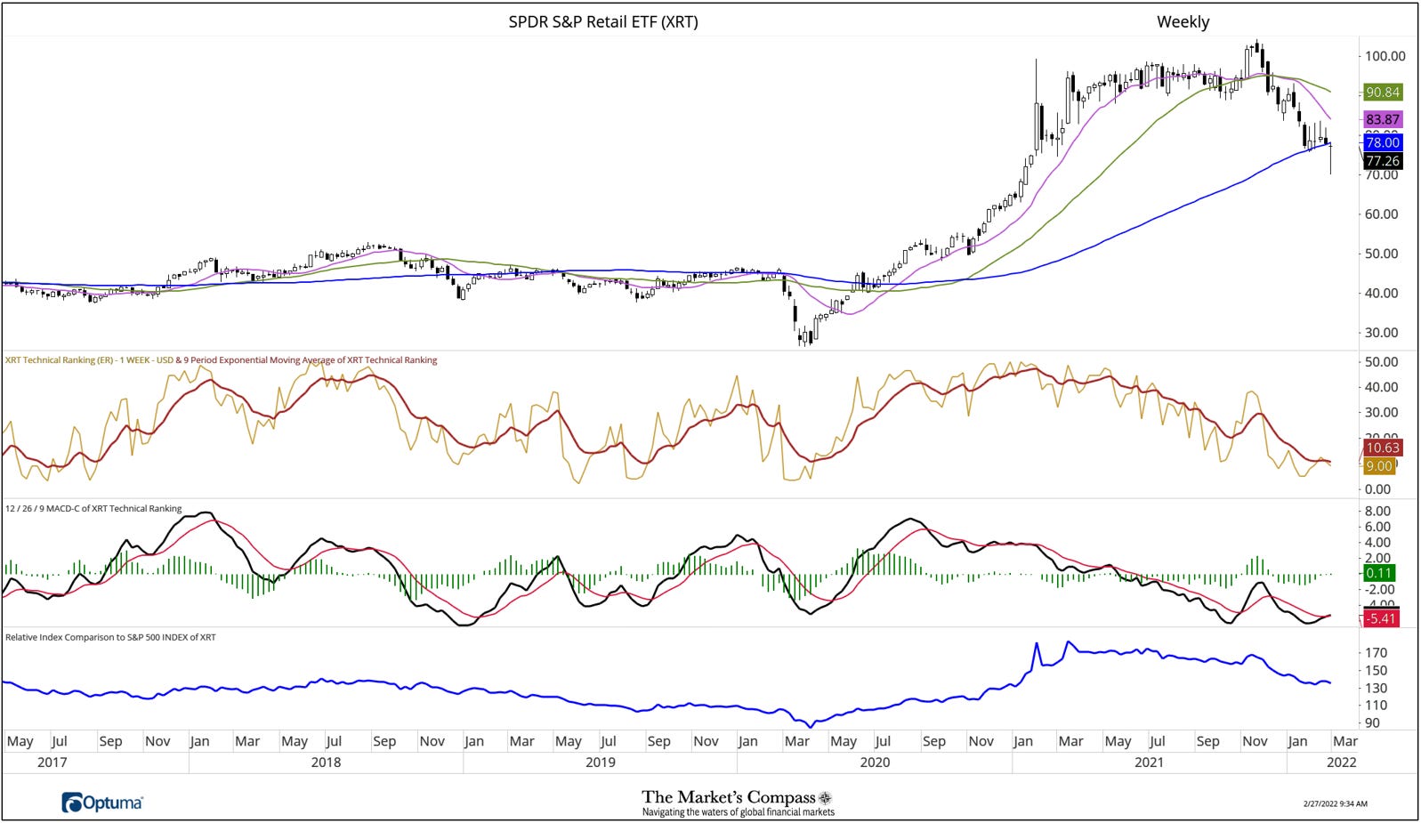
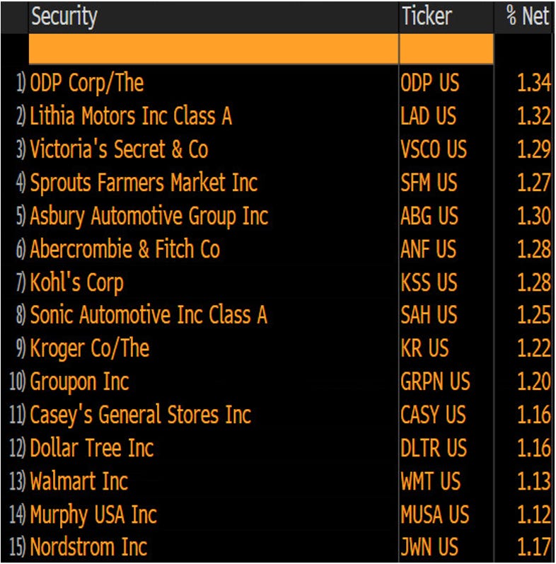
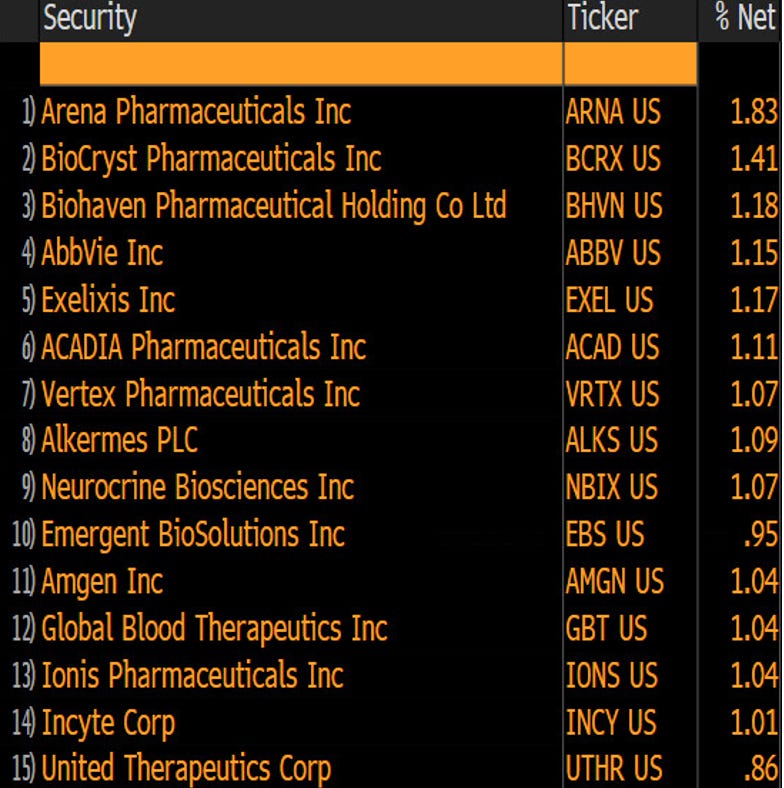
As can be seen on the excel spread sheet presented above , since the end of December the SPDR S&P Retail ETF (XRT) and the SPDR S&P Biotech ETF (XBI) that neither ETF has registered a Technical Ranking (“TR”) reading above 15 for nine weeks. As can be seen in the charts that follow there is little hint that the technical condition has changed despite last week’s intra-week price reversal. Nor have the two ETFs improved on a relative basis vs the SPX Index (blue line, lower panel, on both charts). Below each weekly chart is a list the top 15 holdings in both ETFs.
XRT Holdings

XBI Holdings
The SPX Index with This Week’s Total ETF Ranking “TER” Overlayed
The “TER” Indicator is a total of all 30 ETF rankings and can be looked at as a confirmation/divergence indicator as well as an overbought oversold indicator. As a confirmation/divergence tool: If the broader market as measured by the SPX Index (SP) continues to rally without a commensurate move or higher move in the “TER” the continued rally in the SPX Index becomes increasingly in jeopardy. Conversely, if the SPX Index continues to print lower lows and there is little change or a building improvement in the “TER” a positive divergence is registered. This is, in a fashion, is like a traditional A/D Line. As an overbought/oversold indicator: The closer the “TER” gets to the 1500 level (all 30 ETFs having a “TR” of 50) “things can’t get much better technically” and a growing number individual ETFs have become “stretched” the more of a chance of a pullback in the SPX Index, On the flip side the closer to an extreme low “things can’t get much worse technically” and a growing number of ETFs are “washed out technically” an oversold rally or measurable low is close to be in place. The 13-week exponential moving average in Red smooths the volatile “TR” readings and analytically is a better indicator of trend.
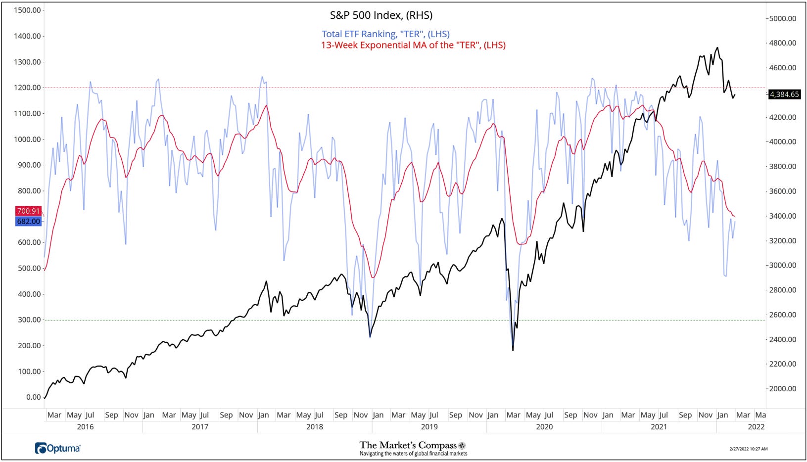
Despite a bounce from the late January low, the Total Technical Ranking (‘TER”) fell back again before last week’s reading of 682 but the TER has yet to “print” a higher high. As we have said before, the best way to analytically view the longer trend of the TER is to focus on the 13-week Exponential moving average (red line) which continues to track lower.
The Average “ATR” of the 30 US Index and Sector ETFs
The weekly Average Technical Ranking (“ATR”) is the average Technical Ranking (“TR”) of the 30 US Index and Sector ETFs we track. Like the “TER”, it is a confirmation/divergence or overbought/oversold indicator.
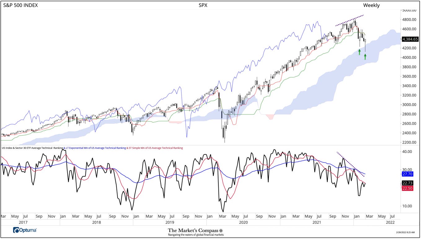
Aside from the two valiant intra-week reversals, the first being the week ending January 28th and the second last week. The former avoided a penetration of the Cloud support. The second traded into the Cloud but closed the week above it (both are highlighted with green arrows). Nonetheless, the downtrend in price continues from the January high (purple dash line in price panel). We brought attention to the divergence and non-confirmation of the January price highs by the Average Weekly Technical Ranking (“ATR”) in our last publication three weeks ago and the downtrend in price continues from the January high (purple dash line in price panel). Despite a bounce in the ATR the trend (purple dashed line in the lower panel) remains lower as does both the longer (blue line) and shorter (red line) moving averages of the ATR with the shorter still tracking below the longer. The afformentioned suggests that the current corrective phase in the SPX Index haslikely not run its course.
The Week Over Week Change in Technical Rankings
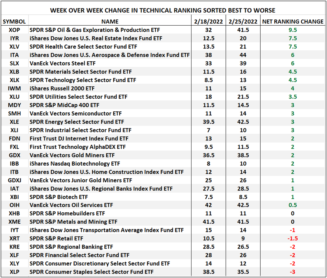
The best three Technical Ranking (“TR”) changes week over week were the SPDR Oil & Gas Exploration & Production ETF (XOP) jumping 9.5 to 41.5 from 32, the iShares Dow Jones U.S. Real Estate Index Fund ETF (IYR) rising 7.5 to 20 from 12.5 and the SPDR Health Care Select Sector Fund ETF (XLY). As can be seen above 28 ETF TRs improved, 2 were unchanged and 6 moved lower for an average TR change of +2.23 This was an improvement over the previous week when only 5 registered improved TRs, 1 was unchanged and 24 TRs moved low for an average TR change of -2.57.
The Weekly Absolute and Relative Price % Changes*
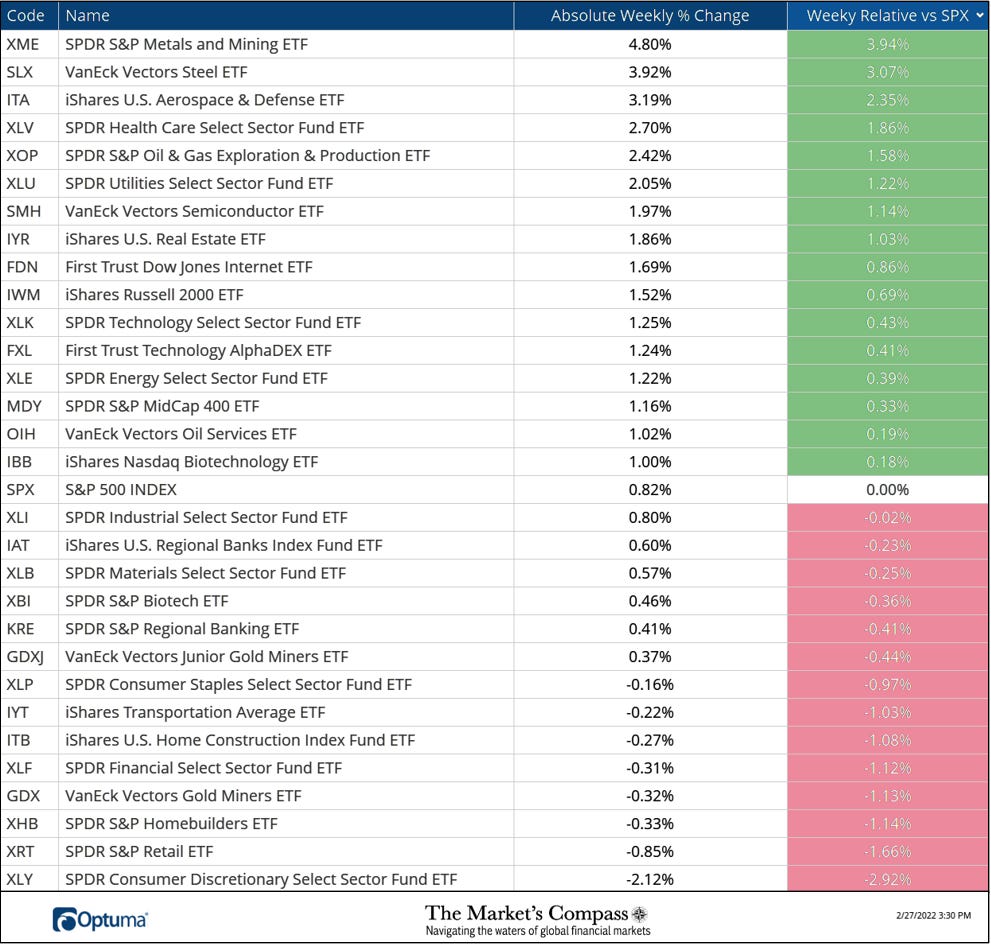
*Does not including dividends
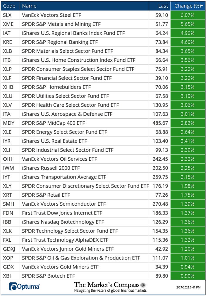
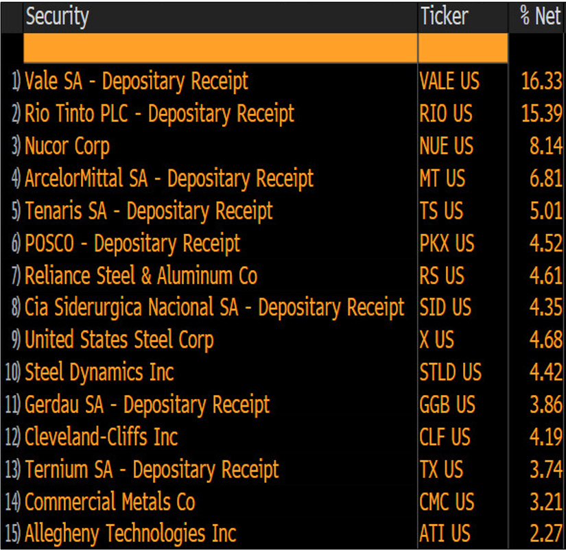
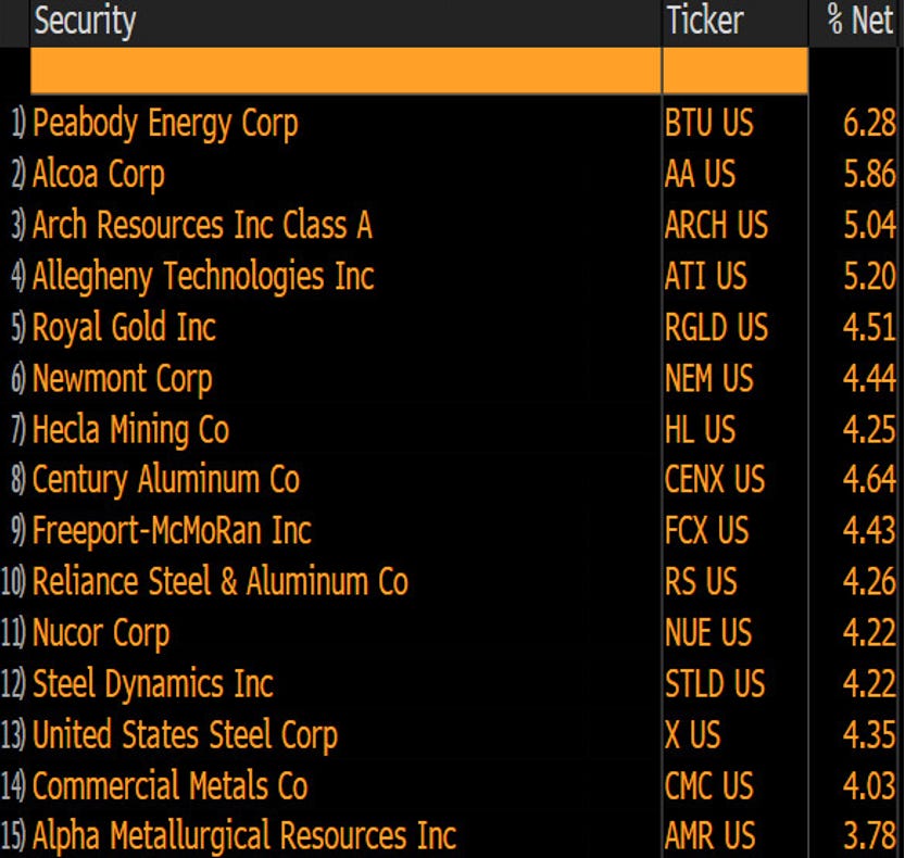
The two best performing ETFs on the week were the SPDR S&P Metals and Mining ETF (XME) and the Van Eck Vectors Steel ETF (SLX) up +4.80% and +3.92% respectively. As can be seen in the spread sheet below both ETFs ended Friday’s trading session with the strongest gains of the 30 U.S. ETFs we track in these pages (which were all up on the day), the gains marked by both lifted the weekly returns of the XME and SLX into positive territory. Daily Charts and the top 15 holdings in each ETF follow.
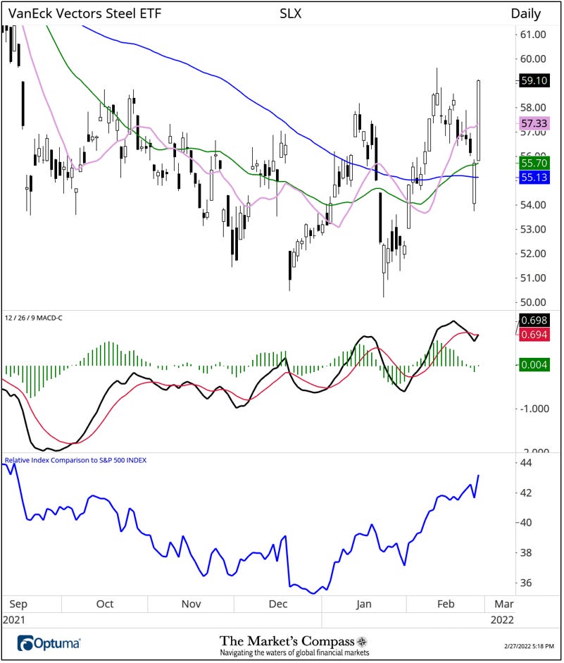
SLX Holdings
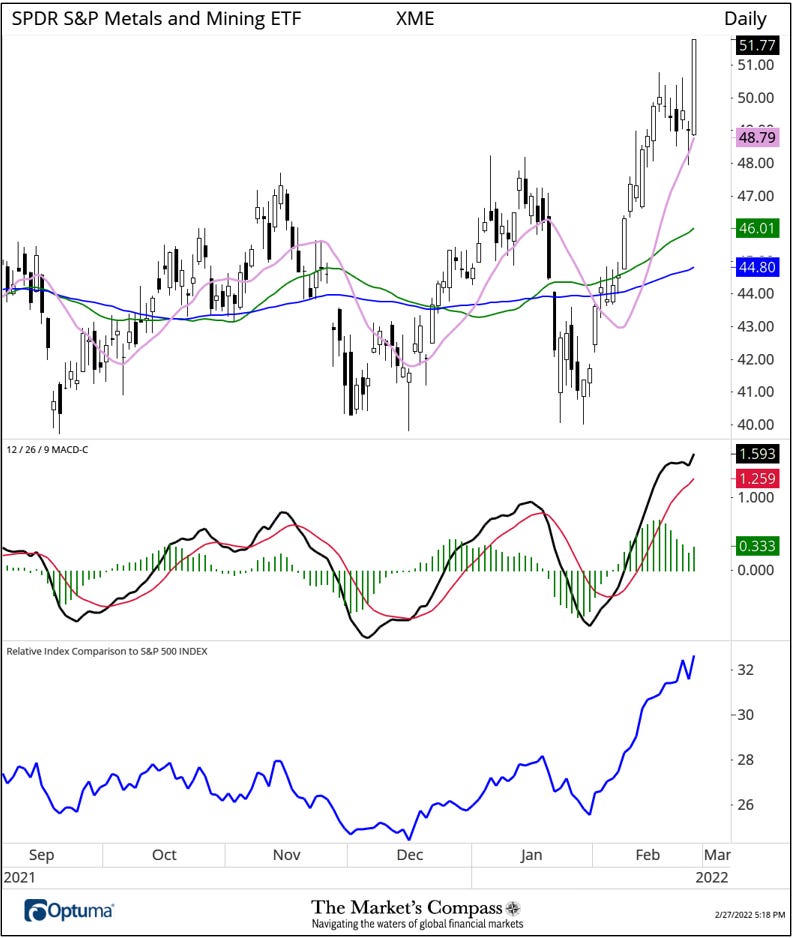
XME Holdings
The Relative Return of the 30 ETFs Vs. the SPX Index Year to Date*
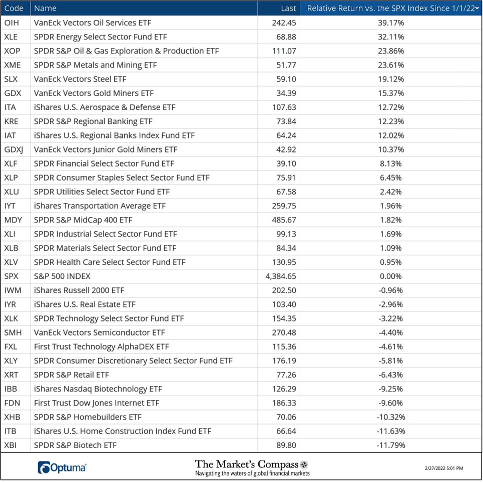
*Does not including dividends
All charts are courtesy of Optuma. All ETF holdings data is courtesy of Bloomberg. I invite our readers to contact me with any questions or comments at…tbrackett@themarkets compass.com